
Learn which dynamic scheduling KPIs measure route efficiency, technician utilization and service performance. And how to use them to improve field service.
ON THIS PAGE
This guide covers dynamic scheduling KPIs.
These metrics reveal whether your schedule changes are genuinely improving your field service.
Whether you're using dynamic scheduling to do it.
Or if you're just moving problems around.
Here's an overview the key indicators when it comes to measuring dynamic scheduling performance:
| KPI | How to Measure It | How It Impacts Dynamic Schedules |
|---|---|---|
| Travel time ratio | Divide total travel time by total shift time across your fleet | Shows how much of each day is spent moving vs. working - high ratios signal route density problems |
| Miles per job | Total miles driven divided by jobs completed per period | Flags inefficient routing and missed bundling opportunities across territories |
| Route density | Jobs completed per geographic zone per day | Reveals whether scheduling is clustering work or scattering technicians across wide areas |
| Productive hours per technician | Scheduled work time minus travel, admin, idle, and wait time | Measures how much of each shift converts into billable output |
| Idle time | Tracked gaps between job completion and next job start | Uncovers scheduling gaps, poor sequencing, or excessive buffer time built into plans |
| Jobs completed per technician per day | Total completed visits divided by active technicians | The clearest utilization signal - and the first thing that shifts when re-optimisation works |
| On-time arrival rate | Percentage of visits where the technician arrived within the committed window | Connects scheduling precision to customer experience directly |
| Appointment adherence | Planned vs. actual job start and completion times | Shows whether schedules are realistic or consistently overrun in the field |
| First-time fix rate | Jobs resolved on the first visit as a percentage of total visits | Indicates whether skills matching and materials planning are working before dispatch |
| Schedule change frequency | Number of intraday changes per day or per technician | High frequency points to reactive planning or poor initial schedule quality |
| Overtime hours | Hours worked beyond contracted shift length per technician | Signals when efficiency gains are being funded by technician strain rather than better scheduling |
| SLA compliance rate | Percentage of jobs completed within contractually defined time windows | The metric your customers and contracts actually care about - everything else supports this one |
Now let's get into more detail about each one:
Why KPI Tracking Matters in Dynamic Scheduling
KPI tracking matters because dynamic scheduling only creates value when your team can measure whether each schedule change is actually improving productivity, performance, and capacity.
That's because having the ability to change schedules in real time isn't the same as running an optimized operation.
Dynamic scheduling gives you constant opportunities to adjust the plan as reality shifts. But those opportunities are worthless if you can't tell whether an adjustment is going to help or hurt you.
Without measurements, leaders can't confirm whether a change is:
- Improving technician utilization;
- Cutting unnecessary travel;
- Protecting service levels;
- Increasing completed jobs, or;
- Quietly creating inefficiency somewhere else.
Consider a common example: A dispatcher successfully inserts an urgent job into a technician's route.
The problem looks solved. But if that insert adds 40 minutes of travel, it pushes a later appointment outside its window. Which drops the technician's number of completed jobs from six to five.
One problem was solved by creating two more.
This is why dynamic scheduling needs a feedback loop.
A dynamic scheduling feedback loop is straightforward:
Analyze what's happening → Identify inefficiencies → Adjust schedules → Measure results → Refine the approach.
This is why having a baseline matters.
Before you can make significant scheduling changes, you need to capture where performance sits today.
Without that starting point, you can't prove anything improved.
Good operational visibility tools make that baseline far easier to establish and monitor over time.
Tracked properly, KPIs surface things that are otherwise invisible:
- Where capacity is being lost during the day
- Which territories or teams are consistently inefficient
- Whether route changes are improving or worsening travel
- Whether service levels hold up during disruption
- Whether scheduling decisions produce measurable gains
One warning applies throughout this article:
KPIs should never be optimized in isolation.
Cutting travel time looks good until it drags down SLA compliance. Pushing utilization higher looks productive until it generates overtime and strips out the flexibility you need when emergencies land.
Effective tracking means reading multiple indicators together and understanding the trade-offs between efficiency, capacity, service quality, and responsiveness.
Metrics like travel, utilization, service levels, and completed work give you the evidence to judge scheduling performance.
Simply put:
Dynamic scheduling tells you what can change. KPI tracking tells you whether those changes actually made your operation better.

Route Efficiency Metrics Every Team Should Monitor
Route efficiency metrics show how effectively your operation converts technician time and vehicle movement into completed jobs, exposing where excessive travel, poor geographic planning, or weak routing is eating capacity.
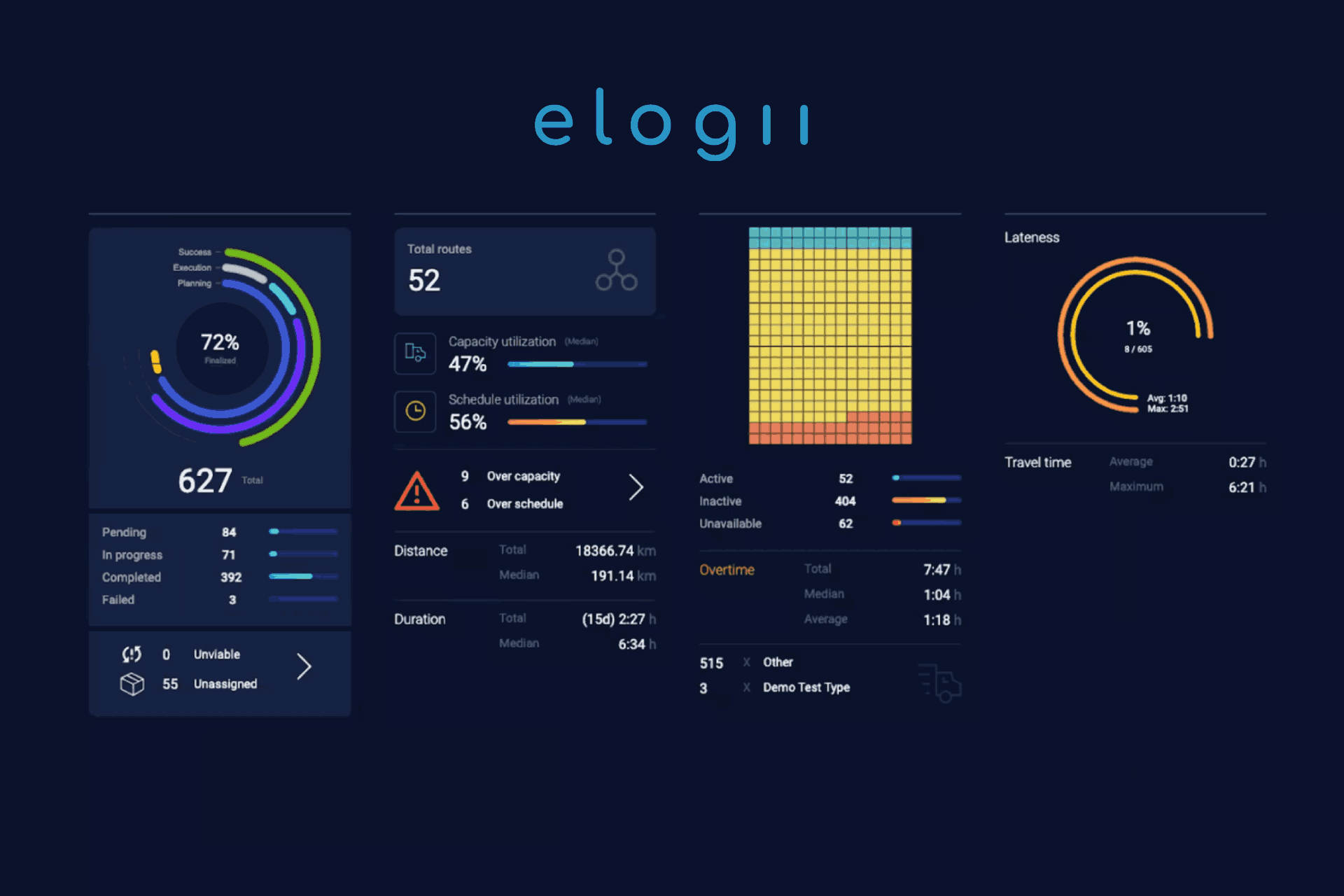
Three metrics carry most of the weight here:
1. Travel Time
Travel time is the portion of a technician's day spent driving between jobs rather than performing them. It matters to field service operations because every hour on the road is an hour not completing work.
Excessive travel cuts productive time, raises fuel and vehicle costs, limits how many jobs fit into a day, and leaves schedules fragile when delays hit.
Two technicians might each complete five jobs, but if one spends two hours traveling and the other spends four, their days aren't equally efficient. The second technician has far less room to support overruns or added and emergency jobs.
However:
You shouldn't reduce travel time always and at all costs.
A longer trip can be fully justified by an urgent job, an SLA commitment, a required certification, or a customer's time window.
The goal is to understanding why your technician is travelling a long distance. If there's a good enough reason, you shouldn't blindly cut it.
2. Route Density
Route density describes how tightly tasks are bundled within a technician's route, service zone, or region. You can bundle tasks by site and geography, while higher density usually means less wasted movement.
Picture two technicians. Each one has eight appointments. One covers a huge region with long gaps between jobs. The other works eight jobs clustered in a few adjacent postcodes. The second technician spends less time behind the wheel.
But job proximity alone doesn't define the best route.
Here too, factors like technician skills, SLA windows, time windows, and job priorities justify a less dense route. A certified technician may need to cross town for a compliance inspection no one else can perform.
Using route efficiency controls to adjust for parameters like route duration or adding distance limits can help enforce sensible caps without ignoring real-world constraints.
3. Miles Per Job
Miles (or kilometers) per job divides the total distance driven by jobs completed, revealing inefficiency that total mileage can't.
Here's an example:
Two teams might each drive 500 miles in a day, but if one completes 100 jobs and the other completes 60, their efficiency is clearly different despite their identical mileage.
That's why the miles per job metric helps surface poor job sequencing, inefficient service zone design, excessive cross-zone driving, and operational capacity consumed by driving rather than completing jobs.
This KPI is especially useful for cost-conscious operations, where cost-focused route optimization can weigh mileage against service commitments.
But like before, you still need to read miles per job in its context.
Job complexity, rural geography, and service requirements all move the number, so more miles per job isn't automatically a failure.
How to Use These Metrics to Improve Route Efficiency?
Use these three together rather than chasing any one.
Reducing miles per job looks like a win until it breaks time windows or lowers SLA performance. The aim isn't the shortest possible routes. It's efficient use of travel and vehicle capacity while still meeting service commitments.
This holds true across trades, whether you're managing HVAC performance tracking or a multi-site maintenance operation.
When schedules shift throughout the day, these transportation KPIs tell you whether your changes are genuinely improving route efficiency or just relocating the inefficiency to a different technician.

Technician Utilization Metrics
Technician utilization metrics show how effectively your field teams convert available working time into productive work, exposing unused capacity and the chance to complete more jobs without adding headcount. Three measures do most of the work.
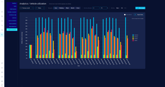
Benchmark ranges get quoted often, and they're useful as context rather than targets.
ServiceTitan notes that utilization ranges between 60%-80% are considered strong.
On the other hand, FieldEdge describes 70% to 85% as a healthy operating range, above 85% as strong productivity that can also increase the risk of technician burnout if workloads aren't managed carefully.
There's no universal ideal rate.
The right number depends on your industry, job mix, and geography.
1. Productive Hours
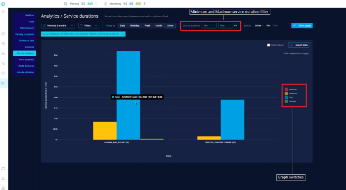
Productive hours measure the time technicians actually spend performing customer or operational work against the total time available.
Two technicians might both work eight-hour days, but one spends six hours on jobs while the other loses time to waiting, backtracking, and schedule gaps.
Productive time isn't only time standing at a customer site. Depending on the operation, preparation, travel, and documentation are legitimate parts of completing work.
Don't try to maximize productive hours at all costs, either.
Run utilization too hot and you strip out the flexibility that keeps the operation resilient when unexpected work appears.
Schedule utilization metrics help you see how much genuine capacity a plan actually uses.
2. Idle Time
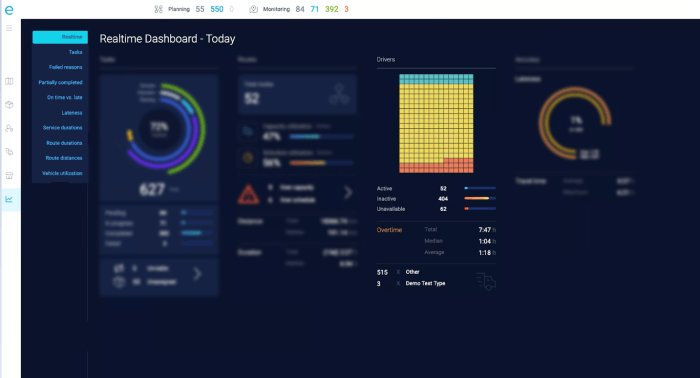
Idle time covers periods when technicians are available but can't do productive work. Common causes include:
- Gaps between appointments
- Waiting for the next job to be assigned
- Poorly sequenced routes
- Late cancellations
- Delays caused by scheduling problems
- Uneven workload distribution across the team
Idle time is expensive because it's capacity you're already paying for but can't use. Fifteen minutes of idle time per technician sounds trivial. Across 200 technicians, that's 50 hours of paid capacity lost every single day.
Not all idle time is bad, though. Some buffer absorbs delays, emergencies, and travel uncertainty. The target is cutting unnecessary idle time without eliminating the slack real operations need.
Balancing that across a large team is exactly what workload performance metrics are built to expose.
3. Jobs Completed Per Day
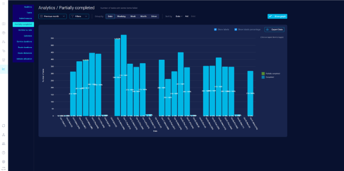
Jobs completed per day gives a plain view of whether available capacity is translating into finished work. If two teams have similar staffing but one consistently completes more jobs without sacrificing quality, that points to better scheduling, routing, or utilization.
Interpret it carefully. Jobs vary in time, skill, and resources, so completing ten simple jobs isn't automatically more productive than completing five complex ones. Read this metric alongside productive hours, idle time, job complexity, and service quality.
How to Use These Metrics to Improve Technician Utilization?
Together, these three metrics tell a fuller story.
A team might show high productive hours but low job counts because its work is complex. Another might complete many jobs while carrying high idle time from uneven scheduling. Viewed together, they help you to separate:
"Our technicians aren't working enough."
From
"Our schedule isn't using the capacity we already have."
When jobs get cancelled, delayed, added, or reprioritized during the day, utilization shifts fast.
Dynamic scheduling can reallocate the remaining work. But it's these metrics that provide the evidence whether the reallocation actually improved your operational capacity.
That's why:
The goal of utilization is to make the best use of available capacity while keeping enough flexibility to handle the unexpected.

Customer Service KPIs
Customer service KPIs show whether your scheduling and field operations are delivering the experience you promised to your customers. Customer service metrics connect your operational decision-making to punctuality, reliability, and satisfaction.
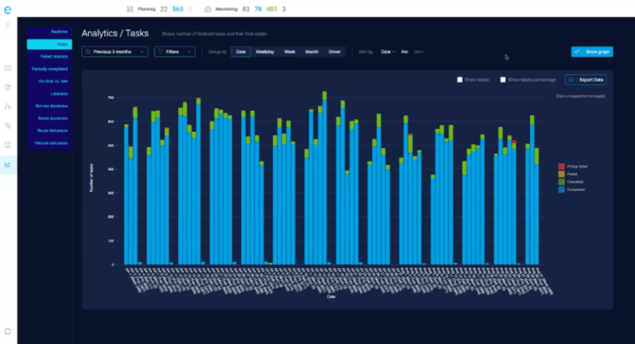
Three measures reveal that chain most clearly:
1. On-Time Arrival Rate
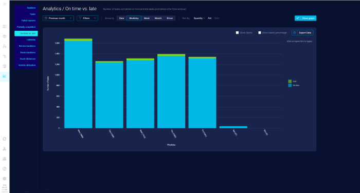
On-time arrival rate measures the percentage of appointments where a technician arrives within the agreed or acceptable window.
Your on-time arrival rate matters because operational efficiency isn't something that your customer really feel. So without it, efficiency wouldn't count.
You can have tight routes and strong utilization and still fail from the customer's point of view. Especially, if your technicians keep showing up late.
The on-time performance of your technicians gets shaped by poor sequencing, excessive travel, unrealistic schedules, traffic, previous jobs running over, and last-minute changes.
To make accurate decisions, judge your on-time arrival KPI against the realities of field work. Don't treat it as a standalone metric to score your schedule.
Accurate predictive ETAs help here.
ETA scaling factors can improve their accuracy, and, more importantly, tell you whether the arrival times you promise to customers are the ones technicians actually hit. (Or not.)
2. Appointment Adherence
Appointment adherence measures how well you deliver appointments according to what was scheduled and promised.
The appointment adherence KPI goes beyond arriving on time. It helps you to determine whether the correct job was completed at the expected time and whether you hold your commitments to the customer.
Here's an example:
A technician might arrive inside the window, but if the appointment was moved twice beforehand or rescheduled without proper notice, the customer still had a poor experience.
Adherence matters most when schedules change during the day.
That's why dynamic scheduling should adapt to disruptions while protecting customer commitments wherever possible.
This is key for recurring-service work like pest control productivity metrics, where missed visits break compliance programs.
3. Customer Satisfaction
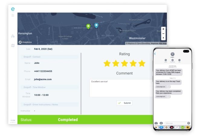
Customer satisfaction is the broader outcome showing whether your performance is actually felt as positive. Satisfaction is influenced by punctuality, reliability, communication, rescheduling, service completion, and overall consistency.
Two operations with similar utilization and route efficiency can earn very different ratings. The one customers prefer usually offers more reliable arrival times and communicates changes clearly.
How to Use These Metrics to Improve Customer Service?
These three form a chain:
On-time arrival → Appointment reliability → Customer satisfaction
Looking at only one can mislead you.
You might improve route efficiency and cut travel time yet watch satisfaction fall because constant schedule changes disrupt appointments.
On the other hand:
Protect every appointment at all costs and you may preserve service levels while creating excess travel, overtime, and underused capacity.
The best scheduling operation balances internal efficiency with the reliability customers experience.
When disruptions hit, dynamic scheduling can adapt routes and assignments while weighing customer commitments. And then, these KPIs are the feedback loop that confirms whether those changes protected customer experience.
A schedule only succeeds if it works for both the operation and your customer.

Operational Health Metrics
Operational health metrics give a broader view of field service performance by revealing whether your scheduling and workforce decisions create sustainable operations, not just efficient routes or high utilization.

Three indicators expose problems the earlier metrics can hide:
1. Overtime
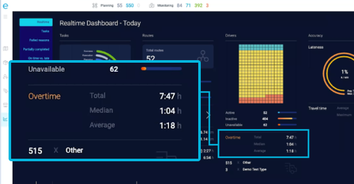
Overtime tells you a lot about the health of an operation.
Persistently high overtime can signal overloaded schedules, poor workload distribution, excessive travel, too many jobs crammed into available capacity, or frequent disruptions pushing work later into the day.
An operation can look highly utilized while actually leaning on overtime to hit its service levels.
On paper the technicians are busy and the SLAs are met. But underneath, the schedule only works because people stay late every day.
Some overtime is unavoidable during demand spikes or emergency work. But the big concern is persistent or unnecessary overtime.
This usually points to a demand-versus-capacity imbalance in your operation which the schedule can't absorb on its own.
2. Schedule Changes
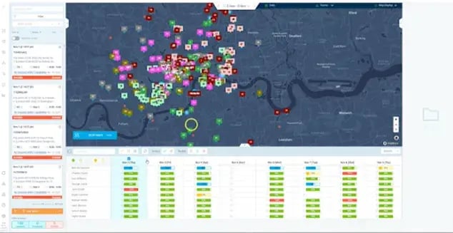
Schedule changes are the adjustments made after the original plan is built:
- Rescheduling
- Reassignment
- Job insertion
- Route changes
- Cancellations
- Unexpected disruptions
The volume and frequency of these changes reveal how stable, or unstable, your operation really is.
If dispatchers spend all day moving jobs to compensate for delays, cancellations, and emergencies, that suggests the original schedule wasn't resilient enough for real conditions.
Managing those changes across large organizations is a core challenge in facility operations analytics.
But schedule changes aren't inherently bad. In fact, in many dynamic operations, plenty schedule changes are necessary and desirable.
The real question is whether changes are controlled and purposeful, protecting important commitments and improving utilization. Or whether they're triggering a chain reaction of further disruption.
3. First-Time Fix Rate
First-time fix rate is the percentage of jobs completed successfully on the first visit, without a follow-up for the same issue. It's an operational health metric, not just a technician scorecard, because a low first-time fix rate can be felt throughout the organization.
Failed first visits create additional trips, more travel, reduced capacity, higher labor costs, more scheduling complexity, and extra customer disruption.
A technician can finish an efficient route on time, but if three of those jobs need return visits, those returns consume future capacity and pile new pressure onto next week's schedule.
The gap between operations is wide.
Aquant's 2025 benchmark found top companies posting a first-time fix rate of 86%, compared to 53% for bottom performers, while broader industry figures often sit around 80%, with close to 90% considered high-achieving.
But treat these percentages as context.
First-time fix rate is influenced by technician skills, job information, parts availability, and job complexity, so don't pin it on scheduling alone.
As one analysis puts it:
First-time fix rate is a lagging indicator. By the time it shows up in reporting, the decisions that determined it were already made in scheduling, dispatch, inventory, and job setup.
How to Use These Metrics to Improve Operational Health?
An operation can report strong utilization and route efficiency while rising overtime, frequent schedule changes, and a falling first-time fix rate reveal that the efficiency is being bought by pushing capacity to its limit.
→ High overtime signals capacity pressure.
→ Frequent schedule changes signal instability.
→ Low first-time fix creates future workload.
Together they tell you whether the operation is genuinely healthy or just managing problems reactively.
A healthy field operation is the one that can absorb change without constantly generating more overtime, more disruption, and more repeat work.
Using KPIs to Continuously Improve Scheduling Performance
KPIs improve scheduling performance when you use them as a continuous loop:
Measure what's happening → Identify where performance falls → Adjust your approach → Measure again.
The value for your ops doesn't live dashboard, but in the actions you take according to the data from the dashboard.
The cycle is simple to describe and harder to sustain:
- Measure: Establish a baseline using relevant scheduling and field performance KPIs.
- Diagnose: Look for recurring patterns rather than isolated events. Pinpoint where capacity, travel, service levels, or stability are affected.
- Change: Adjust the scheduling rules, planning approach, workload distribution, routing logic, or process behind the problem.
- Compare: Measure performance after the change against the original baseline.
- Repeat: Keep refining as demand, geography, workforce, and conditions shift.
Here's how that plays out:
A team notices technicians finishing the day with heavy overtime despite strong utilization.
The reactive move is to tell dispatchers to book fewer jobs. Instead, leaders dig into the data and find that excessive travel between certain appointments is quietly consuming capacity.
They adjust geographic grouping and workload distribution, then watch overtime, travel time, jobs completed, and service performance to confirm the change worked.
That's the difference between reacting to a KPI and diagnosing the problem underneath it.
Always view KPIs together, because improving one can damage another:
- Lower travel time can come at the expense of appointment adherence
- Higher utilization can push up overtime
- Fewer schedule changes can reduce flexibility when emergencies land
- More jobs completed can hurt service quality if schedules turn unrealistic
And your goal shouldn't be to max out individual KPIs. It's to improve overall scheduling performance while balancing efficiency, capacity, service quality, and resilience.
Also, scheduling performance isn't a one-time optimization.
Demand, technician availability, traffic, cancellations, emergencies, and seasonal swings all keep moving, so the model needs ongoing refinement.
Trends matter more than single data points. One high-overtime day is noise. Overtime climbing steadily for six weeks is a signal worth investigating.
Historical field service analytics make those trends visible rather than anecdotal.
But for now, here's a simple framework for turning a signal into a decision:
| KPI Signal | Likely Diagnosis | Action to Test | Measure After | Decision |
|---|---|---|---|---|
| Travel time rising | Jobs spread wider across territories | Tighten geographic assignment rules | Travel time, jobs completed, SLA | Keep, refine, or reverse |
| Overtime rising with high utilization | Capacity pushed past its limit | Rebalance workload, cap daily jobs | Overtime, completed jobs, adherence | Keep, refine, or reverse |
| First-time fix falling | Wrong skills or parts on site | Adjust skills-based assignment | First-time fix, return visits | Keep, refine, or reverse |
| On-time arrival falling | Unrealistic sequencing or windows | Add buffer, resequence routes | On-time rate, jobs completed | Keep, refine, or reverse |
Treat that as a starting point.
Dynamic scheduling makes the loop especially valuable because the operation is constantly adapting to reality anyway.
- Dynamic scheduling changes the plan in response to what's actually happening.
- KPI tracking shows whether those changes produce better outcomes over time.
The real value of KPIs is using that knowledge to make tomorrow's schedule better.
eLogii Enables You to Track Dynamic Scheduling KPIs
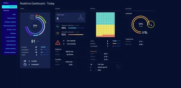
eLogii combines dynamic scheduling with live and historical operational analytics, so you can adapt schedules as conditions change and measure whether those changes actually improve performance.
The analytics span schedule utilization, route distance and duration, travel time, lateness, overtime, task completion, and capacity utilization.
What makes that combination useful is the closed loop.
You monitor what's happening, identify a problem, adjust the schedule dynamically, measure the result, then refine the approach.
eLogii gives you live visibility into the day while also letting you analyze historical performance to spot recurring patterns:
- Live views show current task status, schedule utilization, route distance and duration, overtime, lateness, and travel time.
- A dynamic scheduling and analytics approach shows what's happening during the day, lets you respond, and then shows whether the response worked.
Consider a familiar situation.
Schedule utilization reads high, but overtime keeps climbing week over week. Leaders examine route duration, travel time, lateness, and workload distribution to find where capacity is being consumed. Then adjust how work is scheduled or reallocated during the day, and check the KPIs afterward to see whether the change helped.
eLogii can dynamically re-optimize live routes when new jobs arrive, customers reschedule, or existing work slips, while still respecting skills, vehicles, and time windows.
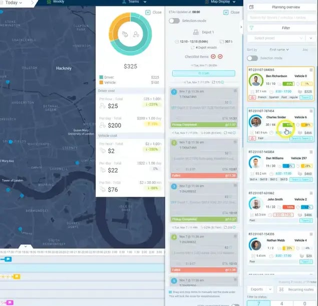
Mapped to the categories in this article, eLogii's analytics let leaders see, diagnose, and improve:
- Route efficiency - travel time, route distance, route duration
- Technician utilization - schedule utilization, capacity utilization, overtime
- Customer service - on-time versus late tasks, lateness
- Operational health - completed and failed tasks, overtime, route utilization, schedule performance
The customer results show what this connection can support in practice, though every outcome reflects a range of factors, not KPI tracking alone.
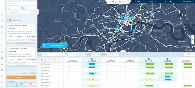
At operational KPI improvements, Vergo Pest Management runs around 400 technicians and uses eLogii to account for its KPIs and SLAs, reporting 3 to 4x ROI and 100% KPI and SLA compliance.

As CEO James Gilding put it:
"eLogii is a hugely flexible tool, allowing us to take into account all of our KPIs and SLAs."
KPI management is built into the operational decision, not bolted on as a separate report.
Complex service environments show the same pattern.
The public sector work behind eLogii's service performance improvements with the Northern Care Alliance NHS Foundation Trust cut manual work sharply and produced accurate, executable routes.

Again driven by better planning and visibility working together rather than any single feature.
The broader advantage is having planning, execution, and measurement connected in one loop.
- A monthly report tells you overtime rose last month.
- A dynamic scheduling and analytics approach shows what's happening during the day, lets you respond, and then shows whether the response worked.
That's because:
You improve scheduling by continuously connecting operational data to scheduling decisions.
The KPI is the signal, dynamic scheduling is the response, and the improvement comes from linking the two.
The Bottom Line
Track KPIs to change decisions. Don't do it just to fill out reports.
The operations that pull ahead treat measurement as the feedback mechanism for dynamic scheduling, using route, utilization, service, and health metrics together to see where capacity is won or lost and what to adjust next.
No single number defines a good schedule.
Cutting travel can hurt adherence, and pushing utilization can breed overtime, so the real work is balancing productivity, capacity, service quality, and resilience while watching the trends over weeks.
Your next step is practical.
Pick one signal that's been bothering you, set a baseline, test a change, and compare the result.
An execution layer like eLogii can connect that measurement to live scheduling, but the discipline is yours.
Good field operations measure performance. The best ones use what the numbers reveal to make the next schedule better.

FAQ about Scheduling KPIs
How often should we review field service scheduling KPIs?
Monitor live metrics continuously for intraday decisions like reassigning a delayed job. Review weekly to catch emerging patterns, and run deeper monthly reviews for trends. A single spike rarely justifies changing your model, while a consistent multi-week trend usually does.
How many KPIs should a field service operation actually track?
Favor a focused set spanning route efficiency, utilization, customer service, and operational health over dozens of metrics. Tracking too many dilutes attention and delays action. Choose the handful that map directly to your current priorities and the commitments you can least afford to break.
Which KPI should we prioritize when two metrics conflict?
There's no universal answer. Prioritize by your current business goal and protect the commitment that costs most to break, which is often an SLA or statutory window. Read the conflicting metrics together so you understand the trade-off before deciding, rather than optimizing one blindly.
How do we set realistic KPI targets for different teams or territories?
Baseline each team and territory separately before setting targets. A dense urban route and a rural region with long drives shouldn't share the same miles-per-job goal. Account for geography, job mix, and route density, and avoid one-size-fits-all numbers that punish teams for their operating conditions.
How do we compare KPI performance across different operating environments?
Normalize for job type, territory size, and density before comparing. Raw numbers mislead when one team handles complex installs and another handles quick inspections. Compare like-for-like segments and focus on trends within each environment rather than ranking teams against a single blended figure.
How can KPI targets accidentally drive the wrong behavior?
Chasing one metric can quietly damage others. Pushing jobs-per-day can hurt first-time fix and quality, and maxing utilization can erode resilience. Pair every target with a guardrail metric, so a rise in completed jobs is always checked against service quality and callback rates.
How do we tell a temporary performance dip from a systemic scheduling problem?
Look for duration and spread. A one-day overtime spike after a storm is a one-off event. The same metric worsening across several weeks, or appearing consistently across multiple teams and territories, points to a systemic scheduling or capacity issue worth diagnosing properly.
How do we measure the impact of a specific scheduling change?
Set a baseline before the change, then compare the same KPIs over a consistent window afterward. Where possible, run a like-for-like control by leaving one region or planner unchanged. Comparing the two isolates the effect of your change from normal day-to-day variation.
